How to Style Your Nightstand: Three Ways

One thing that I’ve gained from this time spent sheltering in place is some fresh perspective on my home and my possessions. I feel like it’s all too easy to fall into the trap of running out and shopping every time you feel like your home could use a little refresh, or just adding a few things to your cart at Target- be it physical or virtual- on your way to checking out. I mean, who can blame you, their decor is affordable, and the selection is good… but what’s even better, more affordable, sustainable, et al., is shopping what you already have and applying a little imagination.
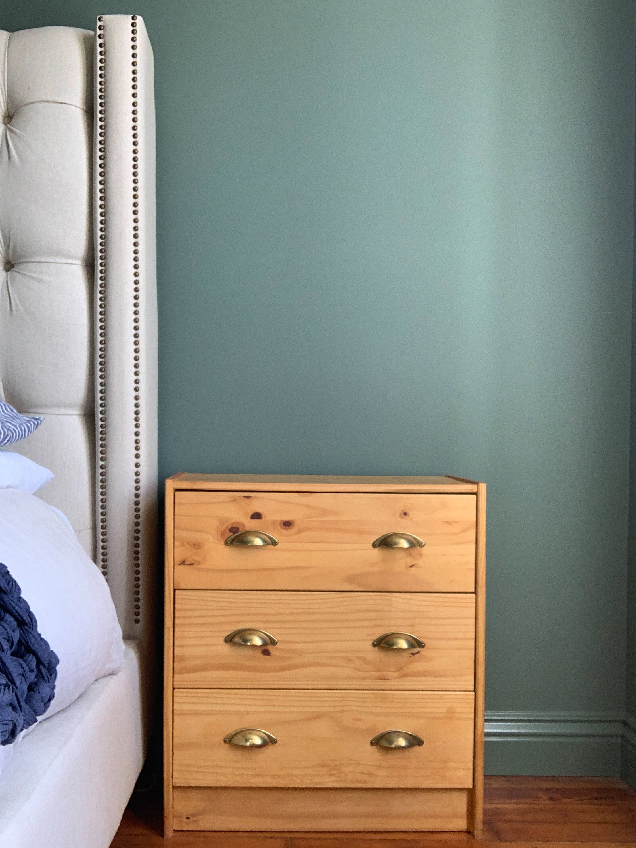
We decided to put this into practice and style out a nightstand in three very different ways. It’s the perfect way to get your creative juices flowing because it’s a relatively small canvas, and what you include is up to you- but we like to incorporate a few key elements when possible. Some reading material, a lamp, a piece of artwork, something scented, and something from nature are our go-to ingredients for a nightstand that encourages you to unwind. Another useful item to consider is a tray or dish of some sort, so you have a place to safely set your jewelry when you take it off at night.
A tip to get you started is to broaden your scope and shop every room of the house. We picked out a pretty perfume bottle from the bathroom, vases from the kitchen and grabbed a tattered textile from the project pile that I planned to sew into a pillow but repurposed as a colorful wall hanging.
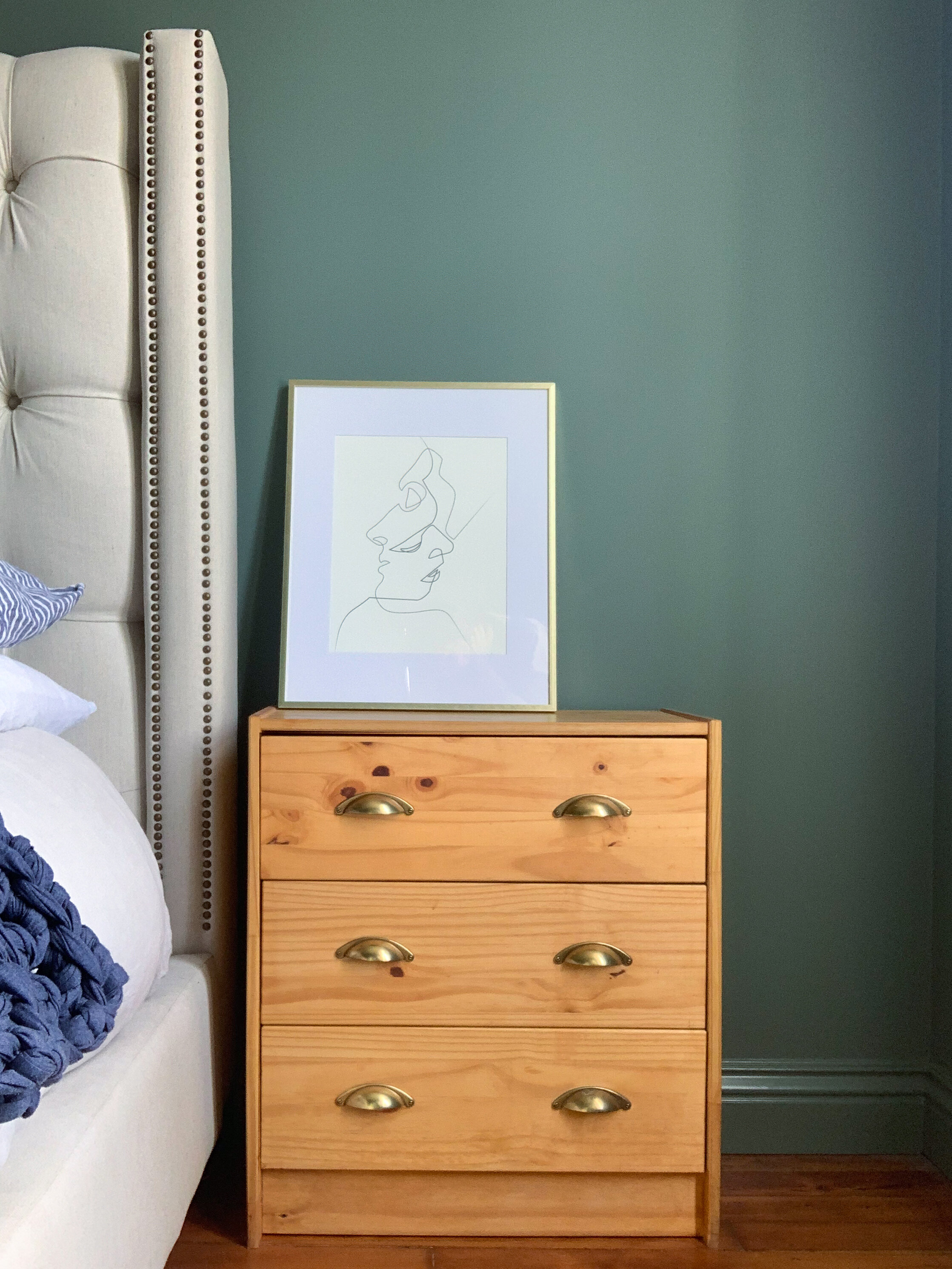
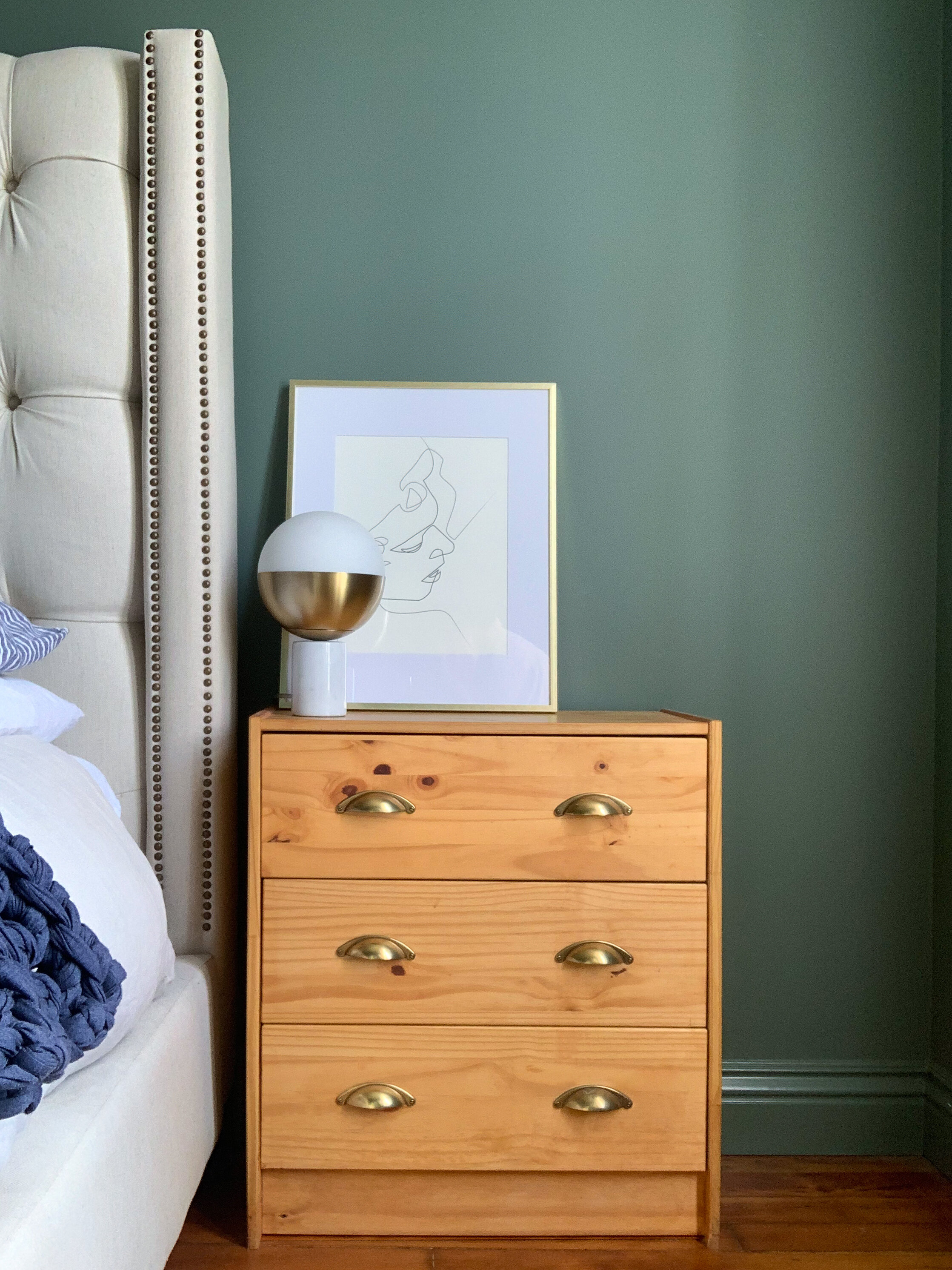
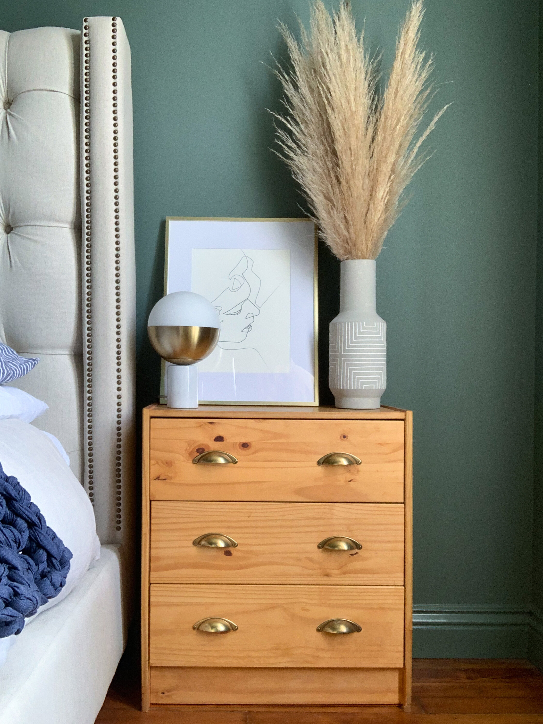
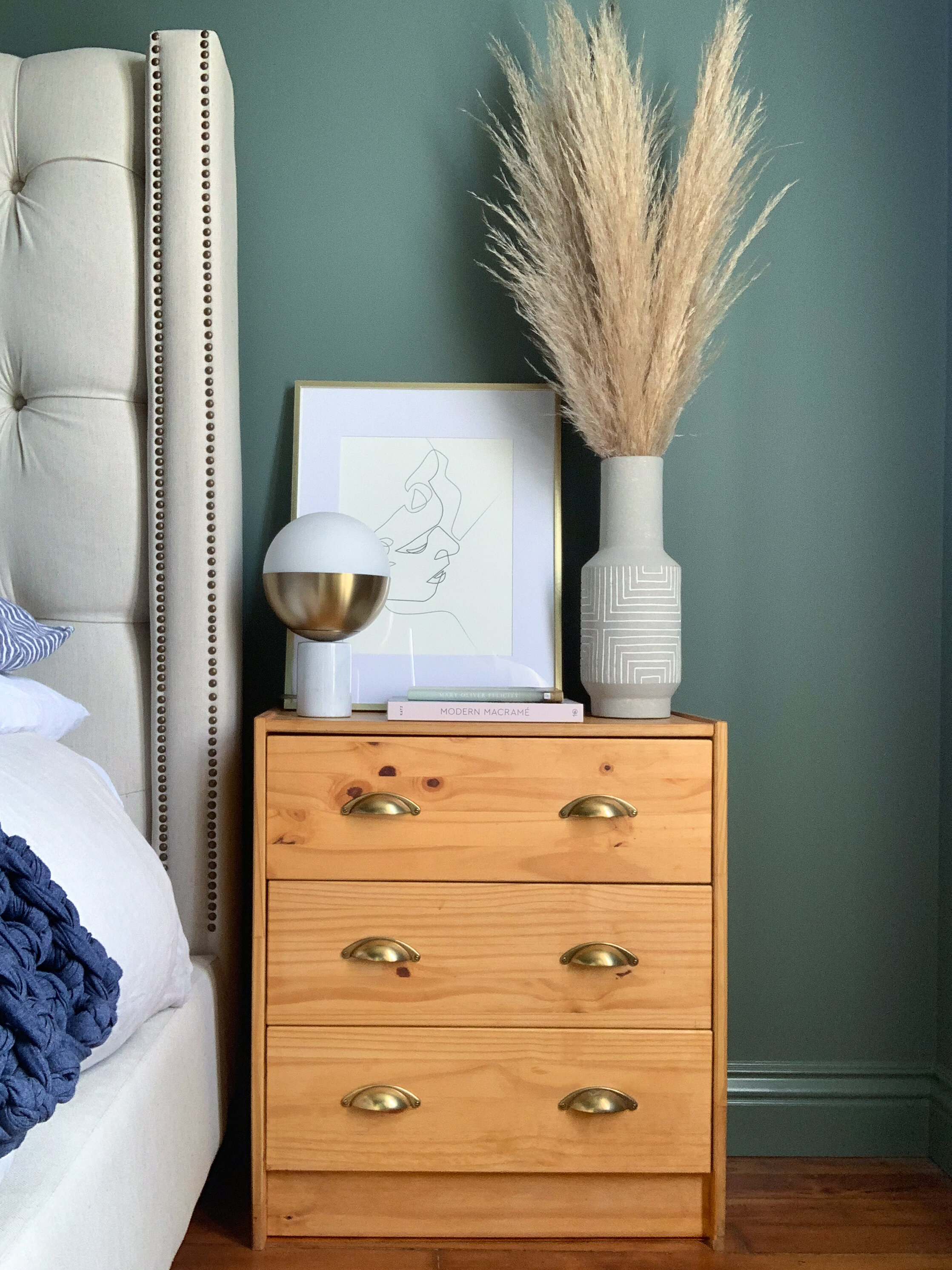

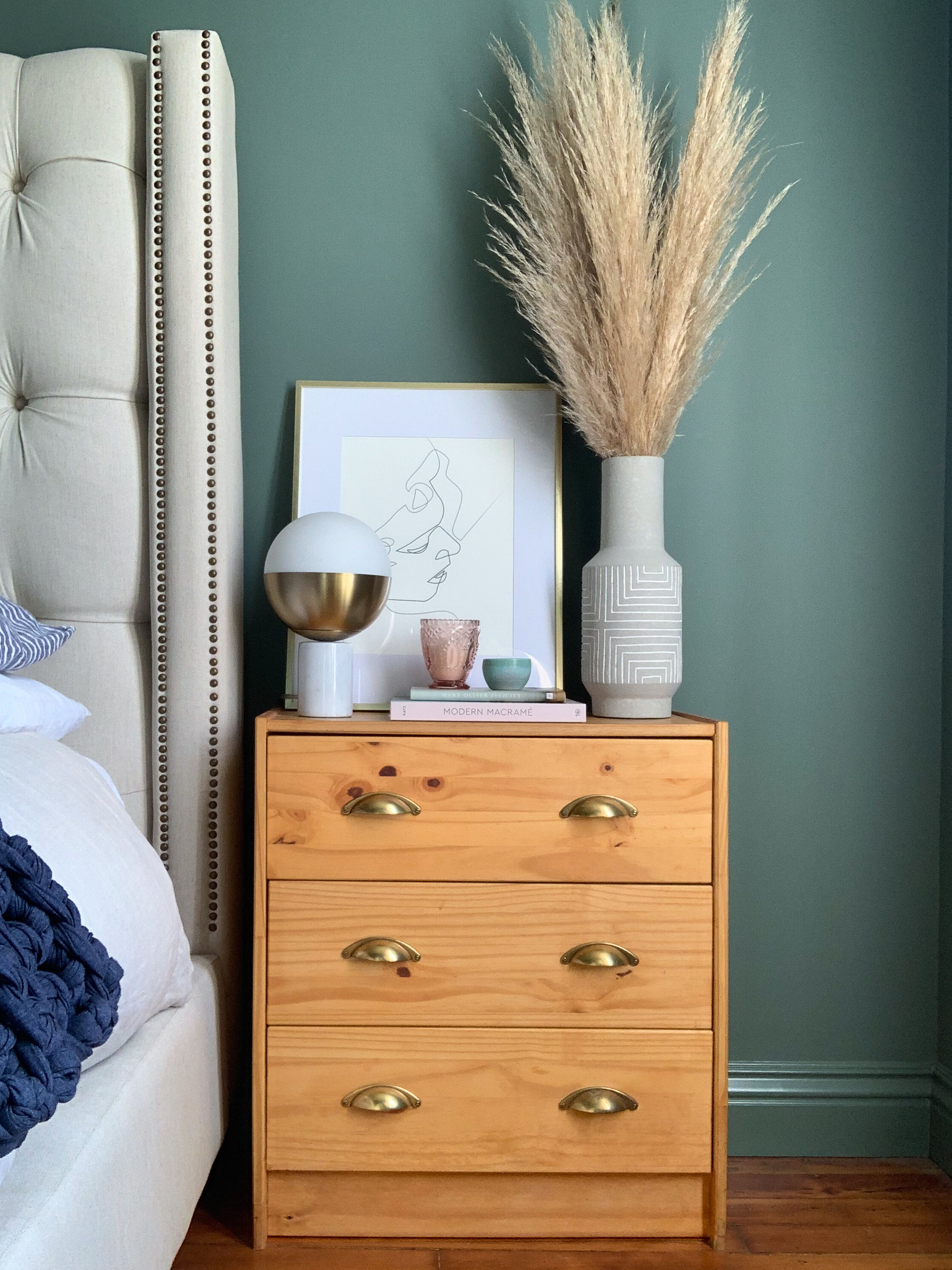
Look One: Pretty Neutral
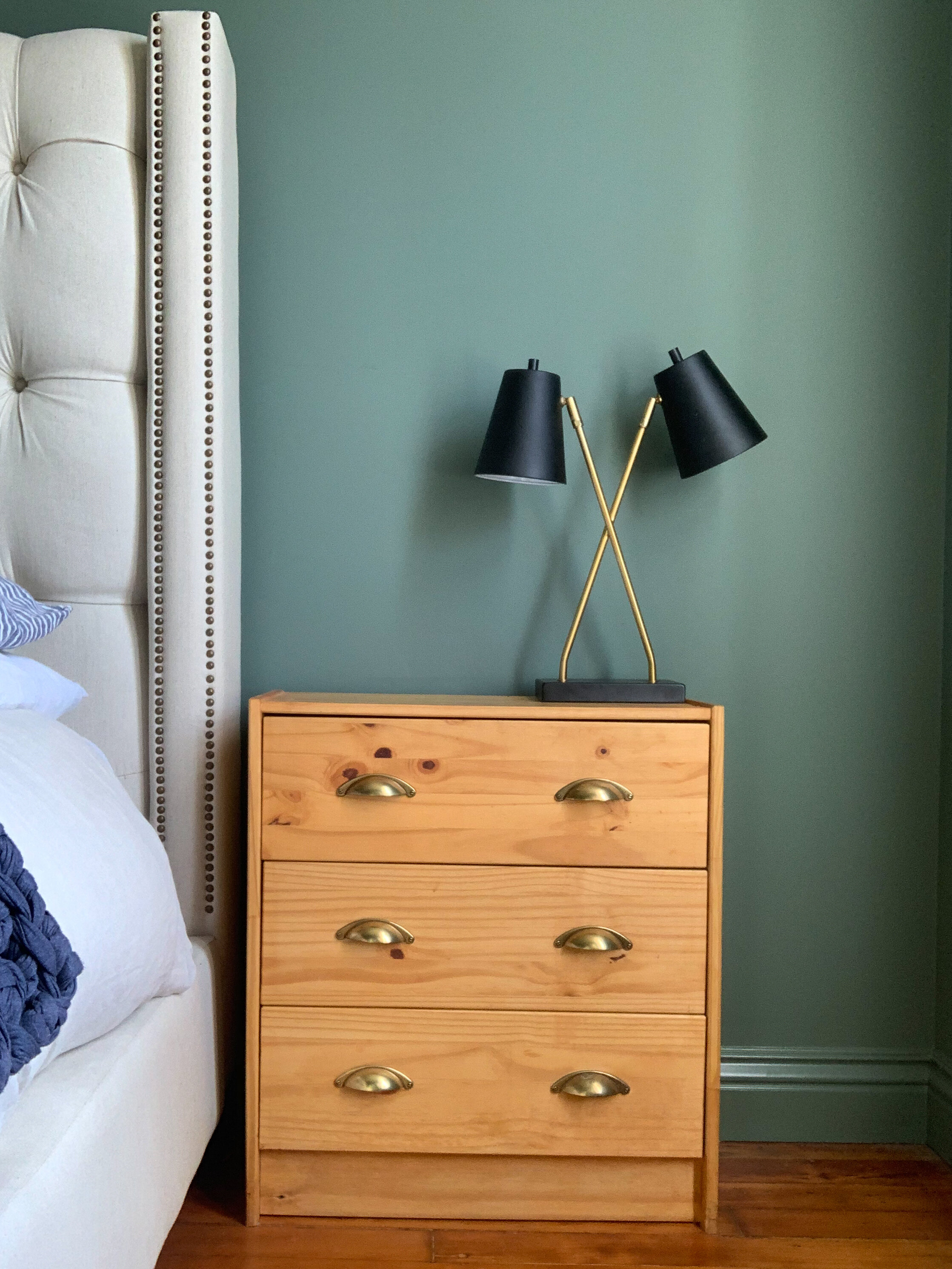
1. Start with a piece of art to anchor the arrangement and set the tone
2. A lamp layered in front of the artwork creates depth and adds a sculptural element
3. A vase filled with Pampas adds texture and creates height
4. A stack of pastel books creates a base for the rest of the items
5. A scented candle in a pretty glass vessel creates ambiance
6. A small bowl for jewelry rounds out the arrangement
For this look, I wanted a neutral arrangement with a few elements that create visual interest. The sculptural lamp and the tall pampas grass keep your eye moving, and the stack of books helps to elevate the smaller items, which helps to keep from them getting lost. Pro tip: grouping smaller items together can help create balance next to larger ones.
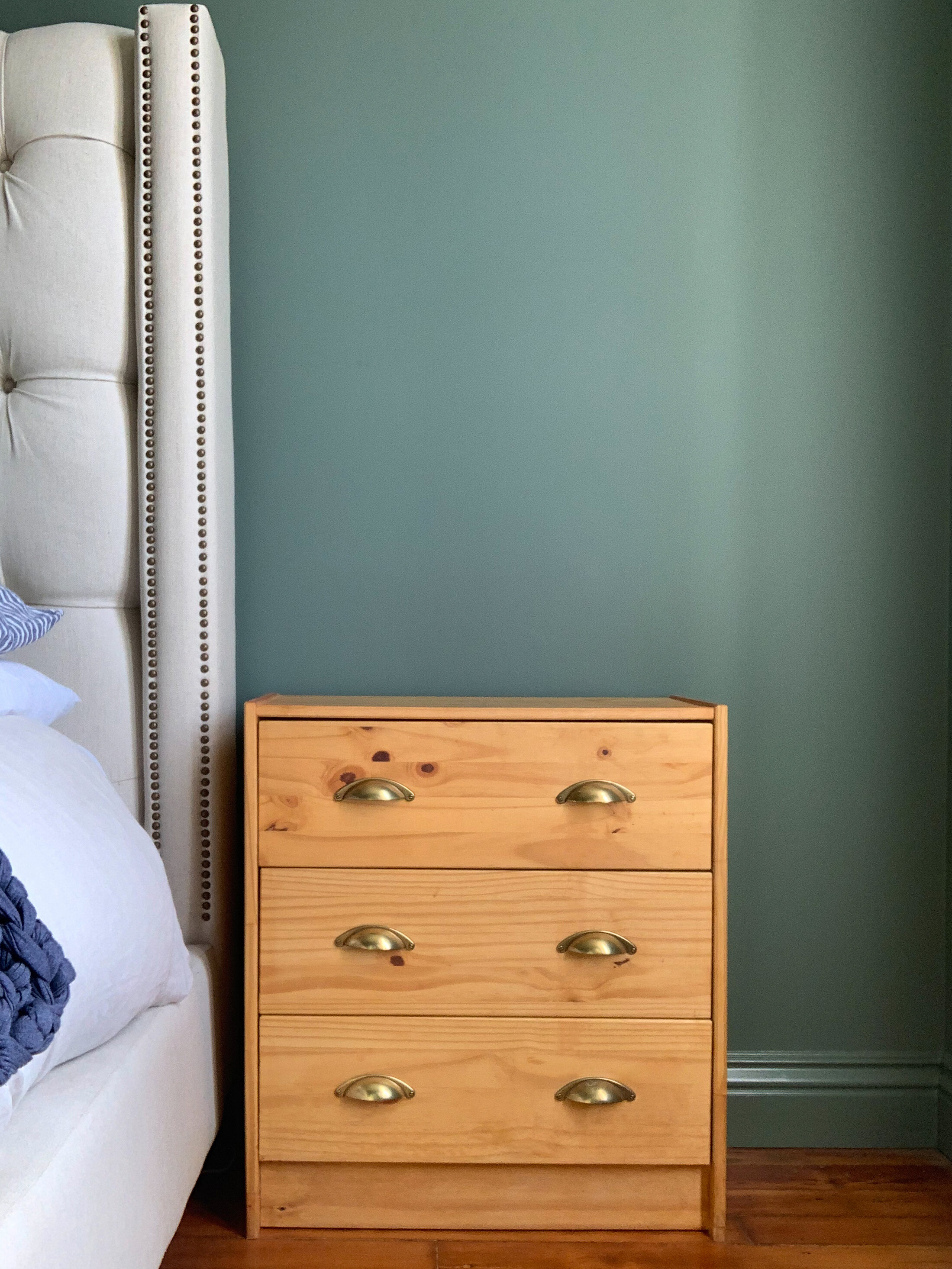
Resources: Nightstand, Ikea (stained with hardware swapped out) | Artwork, Society6 | Lamp, Target (discontinued) | Vase, Target | Books: Modern Macrame and Felicity Mary Oliver Poems | Candle, Target | Bowl, unknown
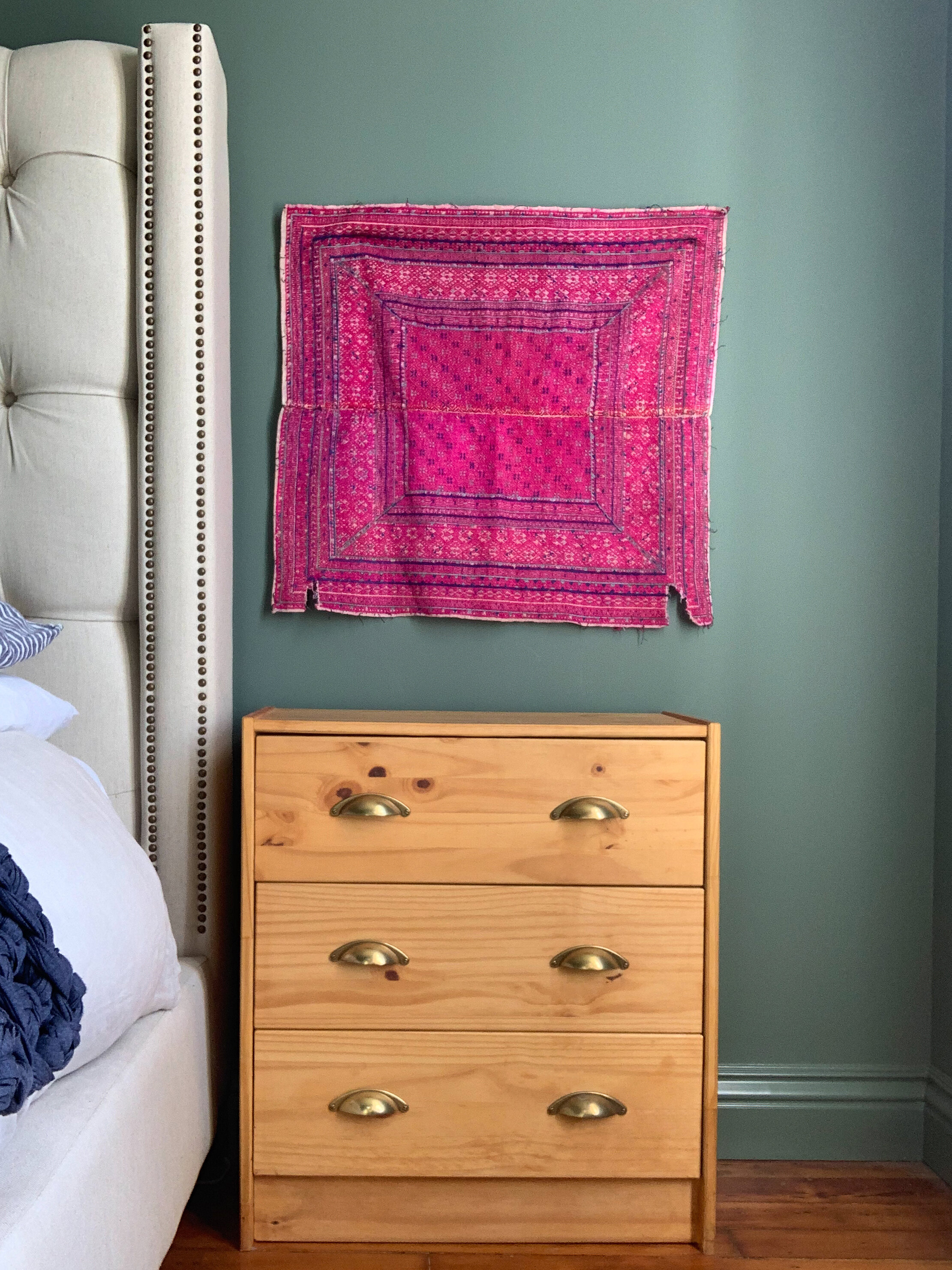
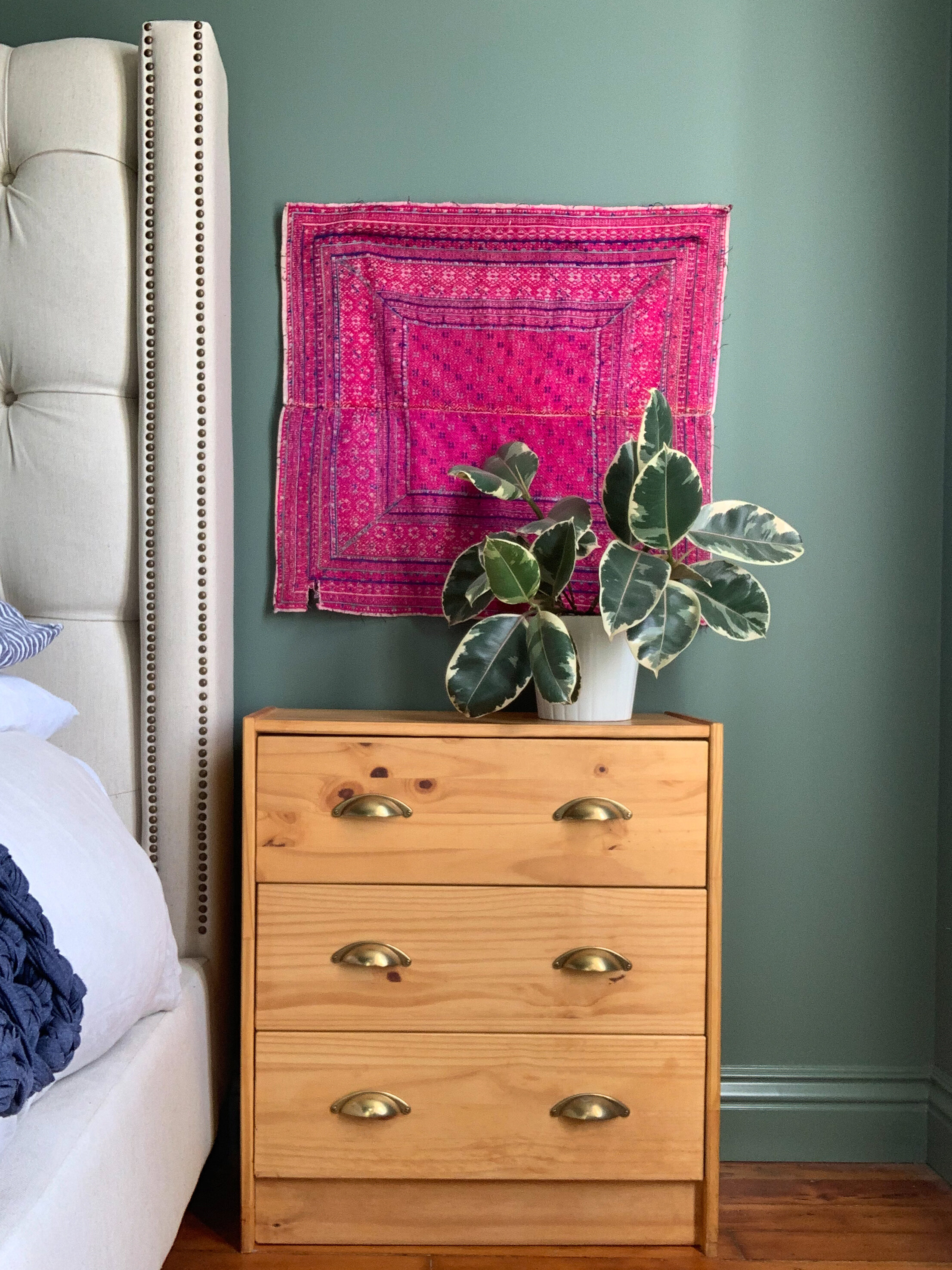
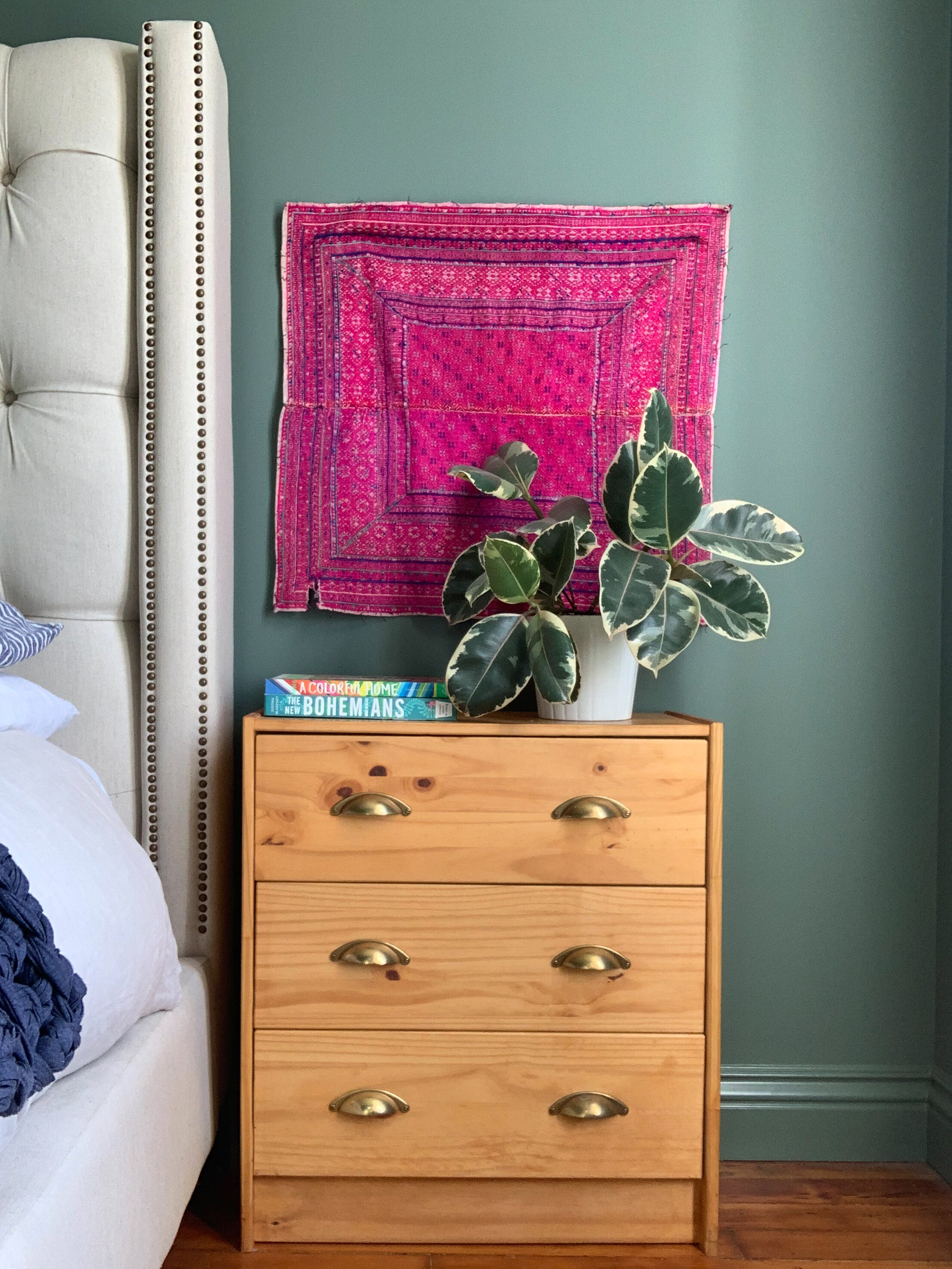
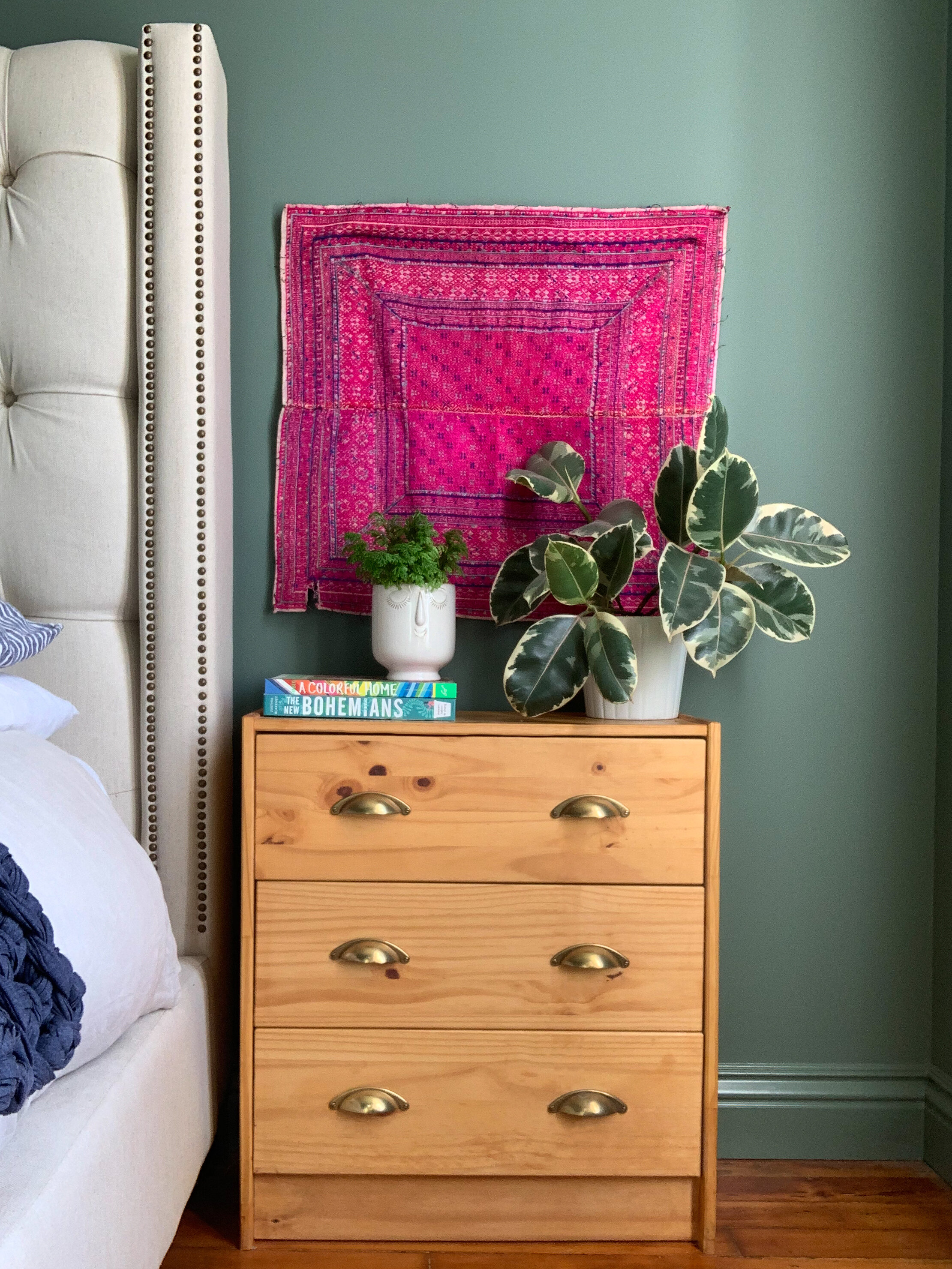
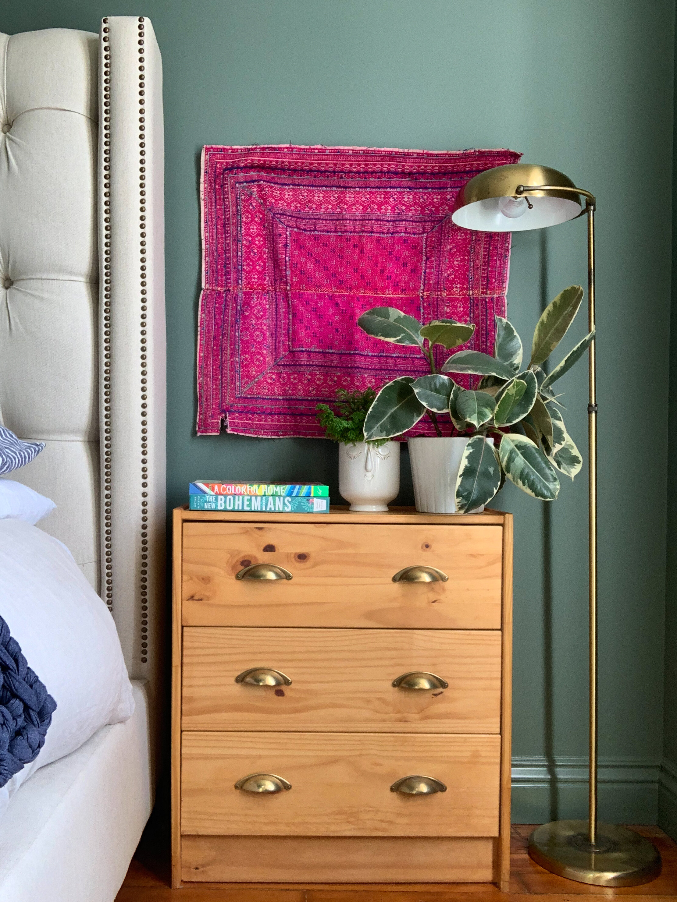

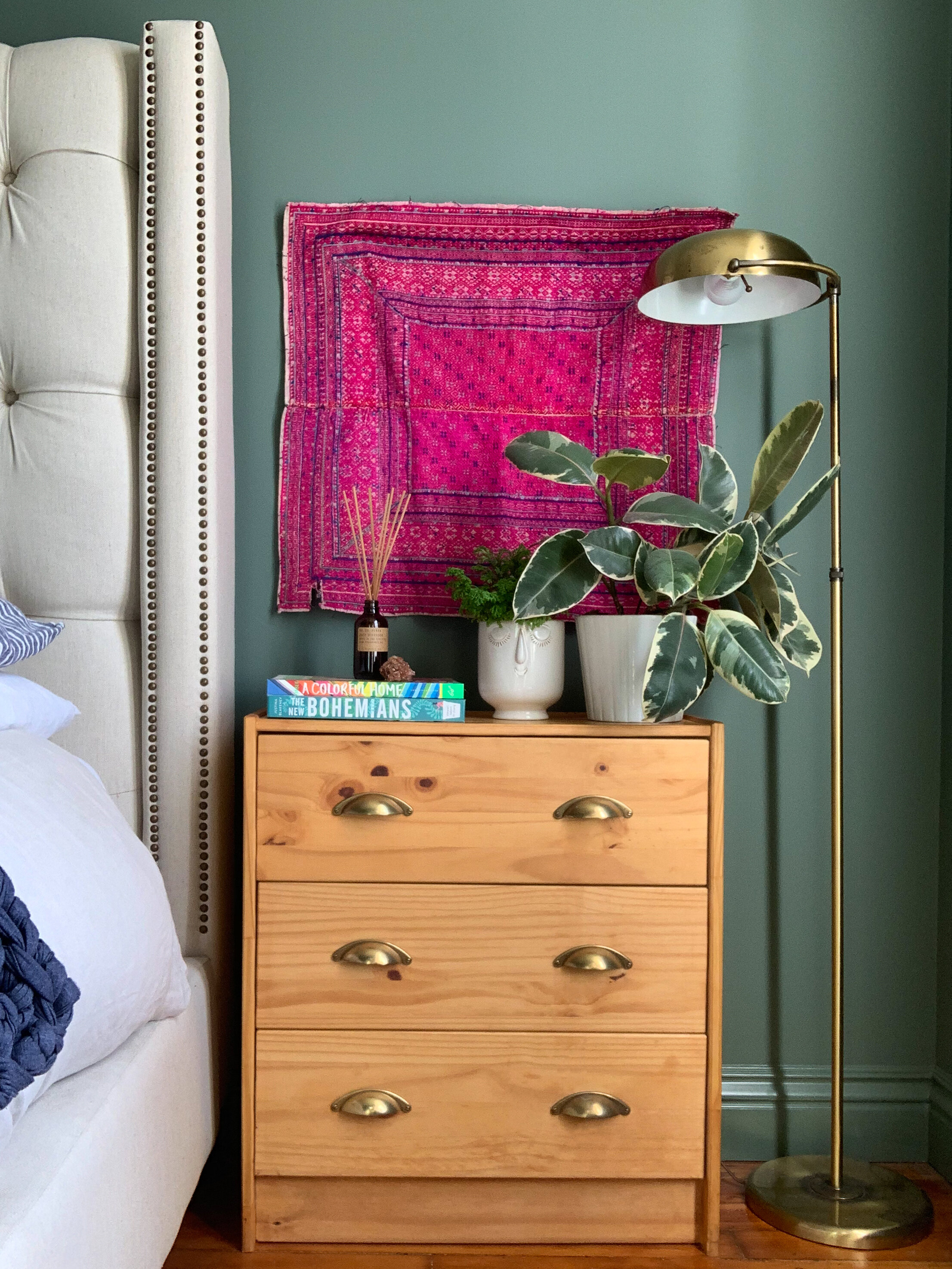
Look Two: Modern Boho
1. Hanging a textile directly on the wall is an unexpected alternative to art
2. Bring in some nature with a plant, the pink textile makes the green pop and keeps it from blending in with the wall
3. A stack of colorful books creates a base for the rest of the items
4. More greenery for a lush look, a quirky vessel adds a playful touch
5. A vintage brass lamp creates height and adds interest
6. A crystal for a hint of sparkle and some good vibes
7. A scented diffuser balances the arrangement and creates atmosphere
This look was inspired by Justina Blakeney’s book The New Bohemians (pictured), the repurposed textile is an unexpected touch and sets the tone with its punchy color and imperfect edges. A cluster of plants makes it feel lush, and the vintage brass lamp adds shine, but a subtle patina keeps it from feeling too new. Finally, the quirky planter and crystal bring in some personality, while the amber bottled diffuser is a cool alternative to a candle.
Resources: Nightstand, Ikea (stained with hardware swapped out) | Textiles, St Frank (OOAK sample) | Books: A Colorful Home and The New Bohemians | Simple Pot, Ikea (discontinued) | Face Pot, Unknown | Diffuser, PF Candle Co | Lamp, Vintage
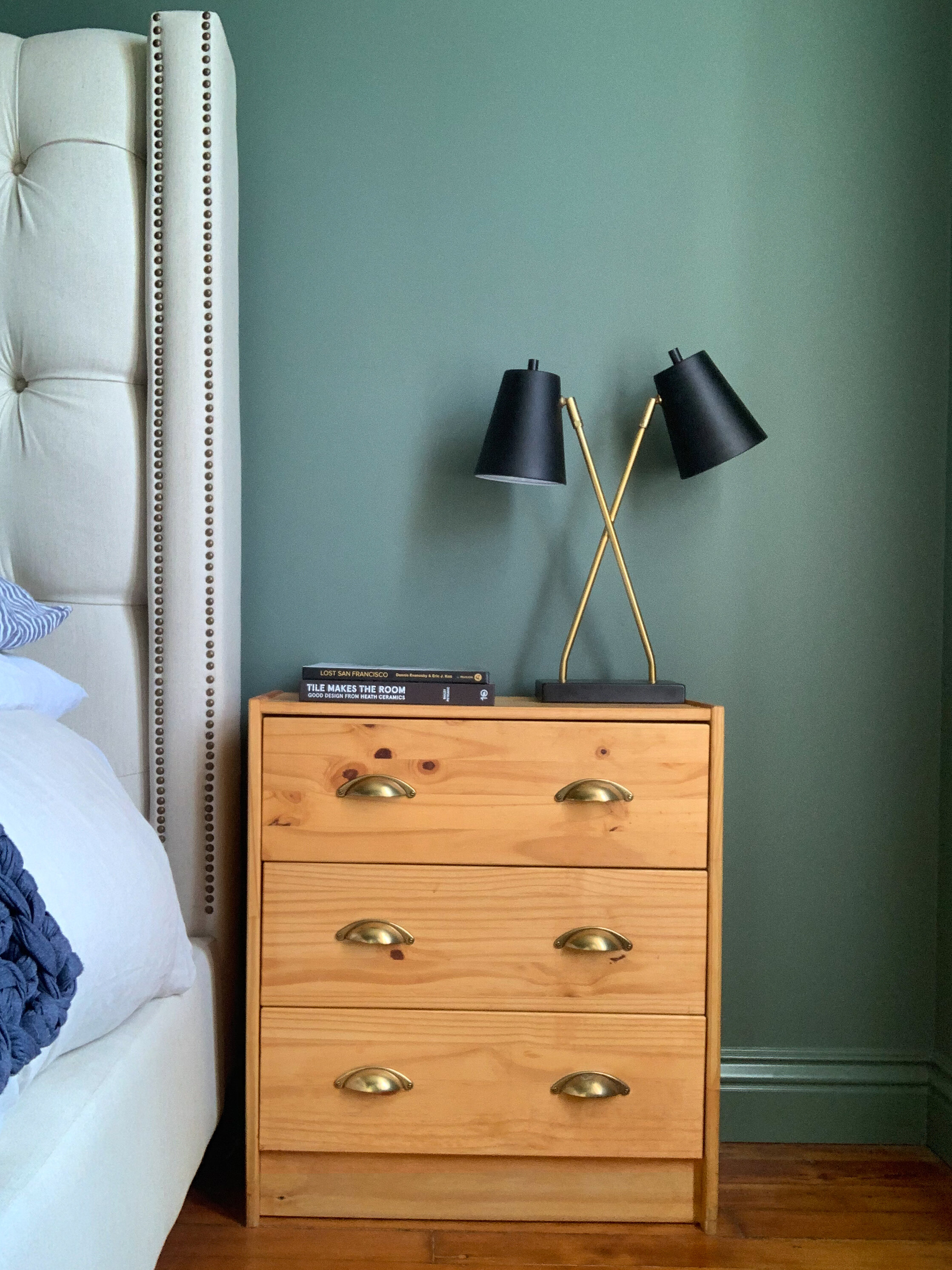
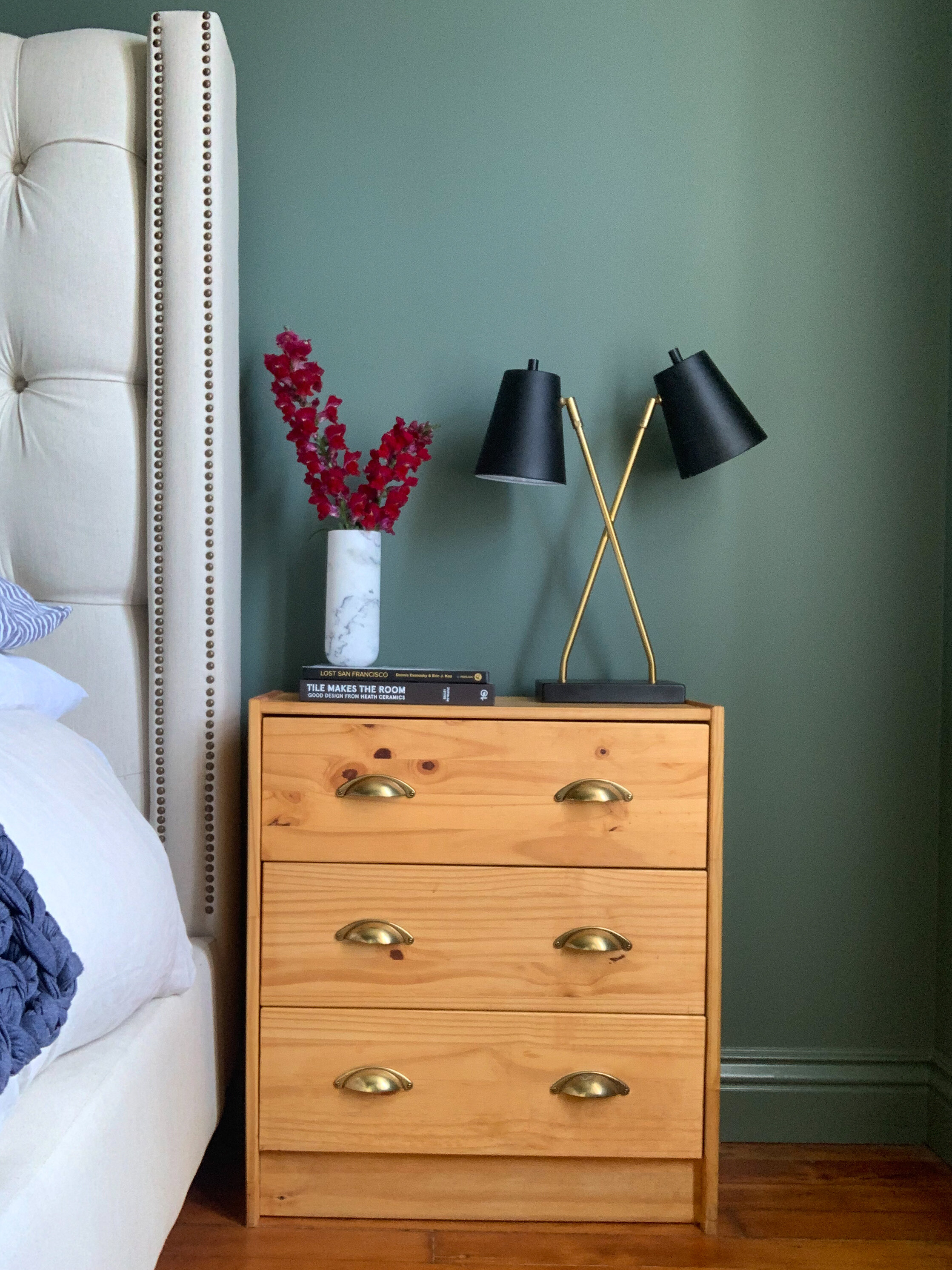

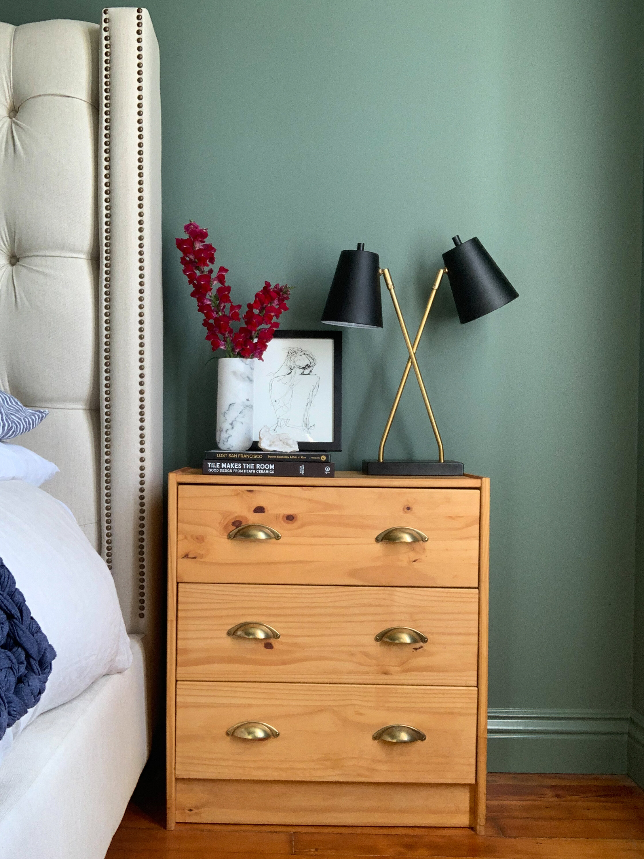
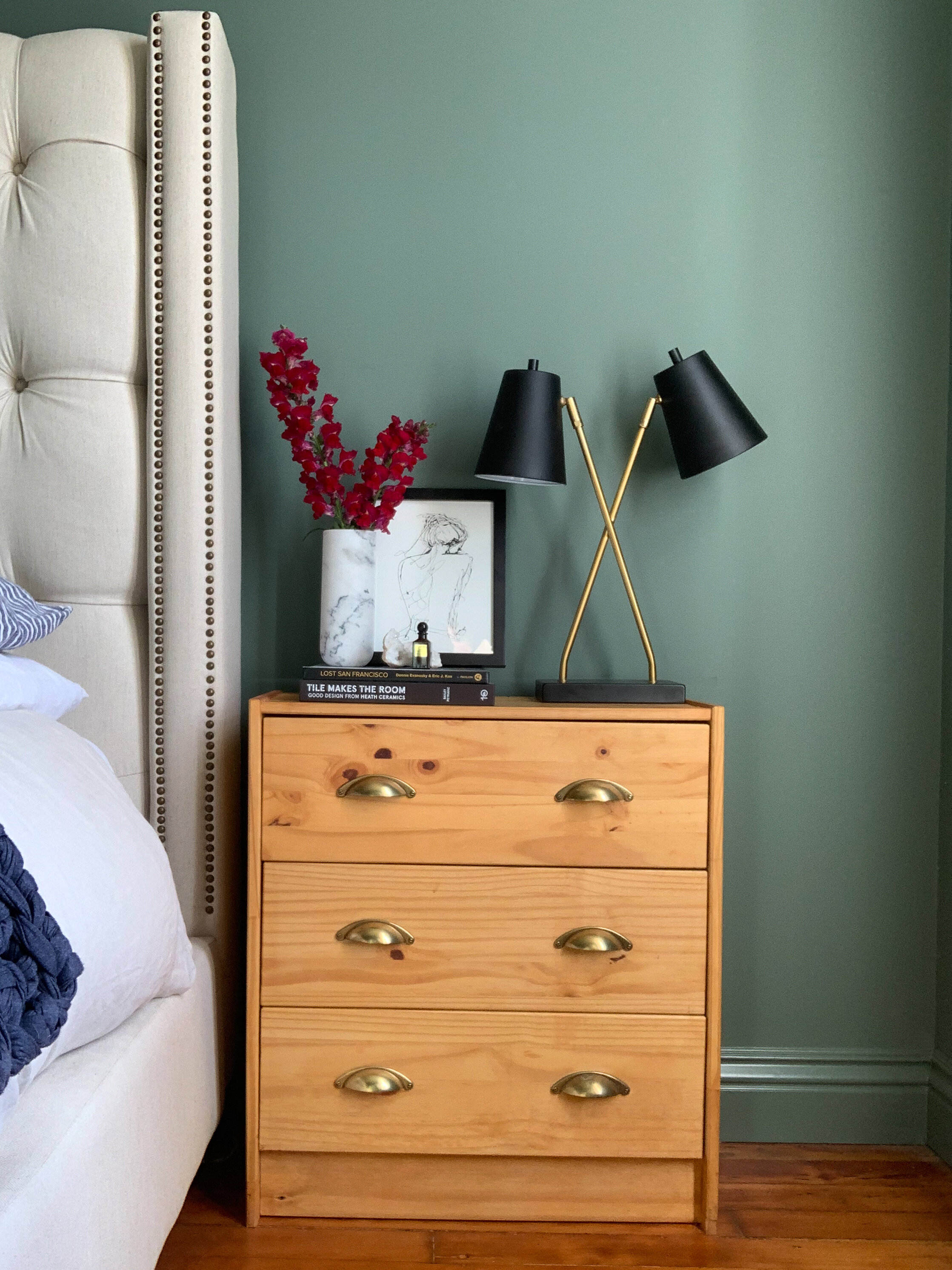
Look Three: Glam Black & White
1. A lamp in black, white and gold sets the palette and creates a graphic shape
2. A monochrome stack of books sets the foundation for the rest of the arrangement
3. A sleek marble vase is filled with red flowers for a single pop of color
4. An expressive black and white print keeps things from feeling too static and adds depth
5. A white crystal brings in another natural element while sticking to the palette
6. A small bottle of perfume is a glam touch
For this final arrangement, I stepped outside my comfort zone and worked with a restricted color palette. The combination of black, white and gold (with a pop of red) is a classic one that’s been around for ages, and for good reason. Deceptively simple, this was actually the trickiest to style because there is nothing to distract the eye when you limit the color palette; it draws more attention to the graphic shapes of the composition. I used several organic elements to break up the strong lines of the lamp, and the sleek form of the vase. The veining of the marble, the expressive lines of the drawing, and even the geode create an organic counterpoint to soften things up and things from feeling too static.
Resources: Nightstand, Ikea (stained with hardware swapped out) | Lamp, Target, | Vase, CB2 (discontinued) | Books: Tile Makes the Room and Lost San Francisco | Artwork, Society6
*This post contains affiliate links and I will be compensated if you make a purchase after clicking on my links, click here for our full policy and disclosures.
If you decide to tackle your own nightstand styling let us know in the comments below or tag us on Instagram @designconfetti. We can’t wait to see what you come up with!